
Part 1: The Foundation: Why Smart Ad Placement is Your Biggest Lever for Growth
Before we dive into specific locations, it's crucial to understand why a thoughtful approach to website ad placement is non-negotiable. Simply throwing ad code onto your site and hoping for the best is a recipe for failure. A smart strategy, on the other hand, creates a virtuous cycle of engaged users and increasing revenue.
The High Cost of Bad Ad Placement
Poorly implemented ads don't just look bad—they actively harm your business from multiple angles:
- User Experience (UX): When ads obstruct content, slow down page loads, or cause the layout to shift unexpectedly, it creates frustration. This erodes the trust you've built with your audience, leading to higher bounce rates and fewer return visitors.
- SEO: Google prioritizes user experience. Core Web Vitals are a direct ranking factor, and bad ad placement is a primary cause of a poor score in Cumulative Layout Shift (CLS)—the metric that measures visual stability. A high CLS can directly harm your search engine rankings.
- Revenue: It's a common misconception that more ads equal more money. Overwhelming users leads to ad blindness, where their brains learn to filter out the clutter. Worse, it encourages the use of ad blockers, meaning your ads are never even seen, and your revenue potential plummets.
Key Metrics That Matter (Beyond Just Clicks)
To build a winning ad strategy, you need to look beyond vanity metrics. Three core concepts will guide your decisions and help you measure what truly matters:
- Viewability: This metric answers a simple question: Is the ad actually being seen by a human? An ad impression is useless if it loads at the bottom of the page and the user never scrolls down to it. The industry standard, set by the IAB, is that 50% of the ad's pixels must be on-screen for at least one continuous second.
- CTR (Click-Through Rate): This is the percentage of viewers who see an ad and then click on it. While a high CTR is often good, it can be misleading. An accidentally clicked ad on a frustrating pop-up doesn't represent a quality interaction.
- RPM (Revenue Per Mille): This stands for Revenue Per 1,000 Impressions (mille is Latin for thousand). It’s a holistic metric that tells you the estimated earnings your site generates for every 1,000 ad impressions served.
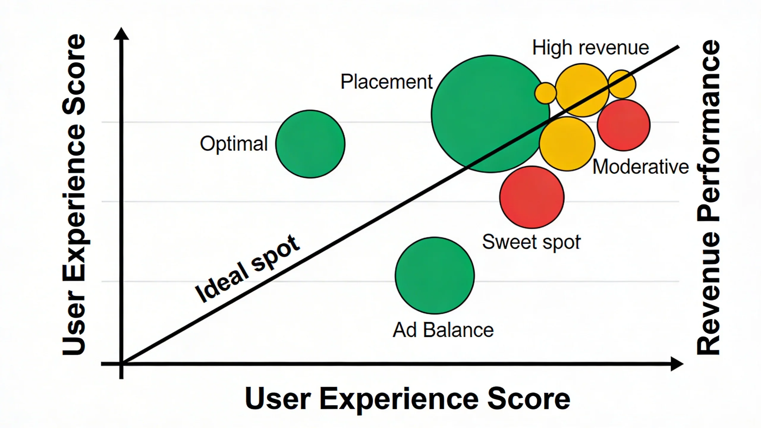
The Crucial Tie-in: The ultimate goal of good ad placement is to optimize all three of these metrics simultaneously. A high-performing ad location has high viewability, attracts quality clicks (good CTR), and therefore contributes to a higher overall RPM, all without sacrificing user experience.
---
Part 2: The 7 High-Performing Ad Locations

Now, let's explore the specific placements that strike the perfect balance between performance and user experience. Each of these locations is effective for a specific, psychology-backed reason.
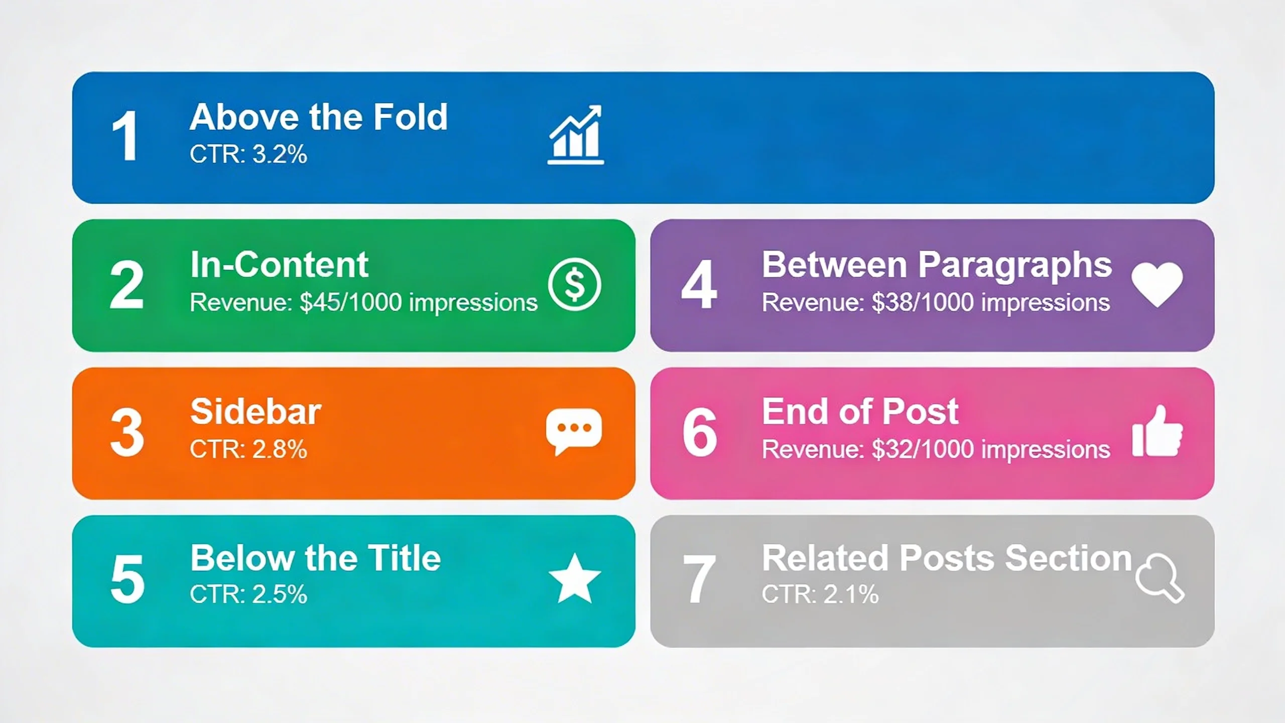
1. The Above-the-Fold Header Ad (The First Impression)
- Why It Works: This is the very first thing many users see, giving it the highest possible initial viewability. It immediately sets the monetization tone of the page in a standard, expected way that users are accustomed to, making it highly effective without being jarring.
- Best Practices: The most common ad size here is the 728x90 "Leaderboard." For larger screens, a 970x250 "Billboard" can perform even better. The most critical technical aspect is to reserve the proper space for the ad container in your site's CSS. This prevents the page content from "jumping" down when the ad loads, which is a major cause of poor CLS scores.
- UX-Friendly Tip: Make this a static ad that loads with the initial page render. Avoid lazy-loading this specific ad or having it pop in late. A stable, predictable header is key to a good first impression.
- Plugin Tie-in: With IMC, you can easily A/B test different header ad sizes to see what performs best for your audience without touching a line of code.
2. The In-Content Ad: After the Introduction (The Content Hook)
- Why It Works: You’ve hooked the reader with a compelling introduction. By placing an ad after the first 2-3 paragraphs, you capture their attention at a moment of high engagement, just before they commit to scrolling through the rest of the article. Their reading pace is slower here, increasing the ad's viewability and chance for interaction.
- Best Practices: A responsive display ad is perfect here. The 300x250 "Medium Rectangle" or 336x280 "Large Rectangle" are top performers. You can align the ad to the left or right of a paragraph, allowing text to wrap around it for a seamless look. Alternatively, a full-width unit can create a clean, intentional break in the content.
- UX-Friendly Tip: White space is your friend. Ensure there's enough padding (margin) around the ad so it doesn't feel crammed against your text. This makes it feel like an integrated part of the page layout rather than a clumsy interruption.
- Plugin Tie-in: IMC lets you automatically insert an ad after the 2nd paragraph across all your blog posts with a single, powerful rule.
3. The Mid-Content Ad (The Scroll Stopper)
- Why It Works: For long-form content (1000+ words), a single ad at the top isn't enough. A mid-content ad re-engages users who are deep into your article. Because they are invested enough to have scrolled this far, they are a highly qualified audience, and an ad placed at a natural pause point has very high viewability.
- Best Practices: Timing is everything. Don't just place an ad after a specific word count. Instead, place it at a logical break in the content flow, such as directly after a subheading, before a bulleted list, or between major sections of the article. This respects the reader's journey.
- UX-Friendly Tip: The absolute worst thing you can do is place an ad in the middle of a sentence, a paragraph, or a numbered list. This breaks the user's cognitive flow, causes immense frustration, and is a clear sign that monetization has been prioritized over the reader.
- Plugin Tie-in: Use our 'smart placement' feature in IMC to automatically find the optimal mid-content position based on word count and page structure, ensuring it never interrupts your content flow.
4. The Sticky Sidebar Ad (The Persistent Companion)
- Why It Works: This is a powerhouse for desktop users. As the reader scrolls down the page, the ad in the sidebar "sticks" and remains in view. This results in extremely high, prolonged viewability rates and a significant RPM boost, all without being directly in the way of the content they are reading.
- Best Practices: This is a desktop-only placement. It requires a vertical ad unit, with the 300x600 "Half Page" being the gold standard. The "stickiness" should only activate after the user scrolls past the ad's initial position in the sidebar, and it must stop before it reaches the website's footer.
- UX-Friendly Tip: The sticky ad must never, ever overlap your main content column or your footer. It needs to be perfectly contained within its own sidebar column for the entire scroll duration. A poorly implemented sticky ad is a major UX violation.
- Plugin Tie-in: Implementing a well-behaved, high-performing sticky sidebar is complex. IMC handles all the technical details perfectly with a simple checkbox.
5. The Post-Content Ad (The Next Step)
- Why It Works: This placement catches the user at a critical moment: they've finished your article and are now deciding what to do next. Their cognitive load is lower, making them more receptive to a new message. It's an excellent location for highly relevant, contextual ads that can guide their next action.
- Best Practices: Place this ad unit directly below the final paragraph of your article but before the author bio or comments section. This is a prime spot for both standard display ads and native ad units (like Taboola or Outbrain) that match your site's style and recommend related content.
- UX-Friendly Tip: Because it appears at the end of the user's journey with that piece of content, this is a great place for less "salesy" ads. Sponsored content recommendations or ads for related products can feel like a natural, helpful continuation rather than a hard sell.
- Plugin Tie-in: Our targeting rules in IMC allow you to show specific ad categories in the post-content slot based on the article's category, dramatically increasing relevance and CTR.
6. The Mobile Sticky Anchor Ad (The Thumb's-Reach Performer)
- Why It Works: Anchored to the bottom of the screen on mobile devices, this ad unit has nearly 100% viewability for the entire session. It stays in a consistent, predictable location within the user's thumb-reach, making it highly effective without ever covering the content the user is actively reading.
- Best Practices: This is a mobile-only placement. According to Google's policies and UX best practices, it must be easily dismissible by the user with a clear 'X' or close button. It should also not be excessively tall; a 320x50 "Mobile Banner" is the standard size that provides value without taking up too much precious screen real estate.
- UX-Friendly Tip: The ability for the user to close the ad is completely non-negotiable. Forcing a persistent anchor ad on a user is a major UX violation, a breach of Google's Better Ads Standards, and a surefire way to make them leave your site.
- Plugin Tie-in: IMC includes a fully compliant, user-friendly mobile anchor unit that you can enable for mobile devices with one simple click.
7. The Vignette Ad (The Page-Transition Monetizer)
- Why It Works: This is a full-screen ad that appears when a user navigates between pages on your site (e.g., clicking a link from your homepage to an article). It's considered less intrusive because it doesn't interrupt them while they are actively reading or consuming content. It appears during a natural pause in their journey.
- Best Practices: Don't try to code this yourself. It's best to let Google Auto Ads or a sophisticated ad management platform handle the triggering. These systems have built-in frequency caps to ensure a user doesn't see a vignette ad on every single click, which would quickly become annoying.
- UX-Friendly Tip: Just like anchor ads, vignettes must be instantly and easily dismissible. The user's intent is to get to the next page, so trapping them on an ad screen, even for a few seconds, creates a negative experience. A clear "Close" or "Continue to site" link is essential.
- Plugin Tie-in: Our platform integrates seamlessly with Google's ad serving to enable and control vignette ads, ensuring they only show at optimal, non-annoying intervals for maximum impact.
---
Part 3: Beyond Placement: 3 Golden Rules for a Winning Ad Strategy
Implementing these seven placements will put you far ahead of the competition. But to truly master the art of monetization, you need to think strategically. This elevates your approach from a simple checklist to a holistic, revenue-generating system.
Putting It All Together for Maximum Revenue and Happy Readers
- Rule #1: Less is More. It’s tempting to cram every possible ad slot onto a page, but this often backfires. Too many ads create a cluttered, slow, and untrustworthy experience. They also force advertisers to compete against each other on your page, which can sometimes lower the value (CPM) of each individual ad spot. Start with 3-4 strategic placements from the list above and test their performance. You'll often find that a few high-viewability ads generate more revenue than a dozen poorly placed ones.
- Rule #2: Mobile-First Always. With over half of all web traffic coming from mobile devices, your ad strategy must be designed for the small screen first. A sticky sidebar is great on desktop but useless on mobile. A 728x90 leaderboard is a standard on desktop but will break your layout on a phone. Always plan and review your ad placements on a mobile device first, then adapt them for desktop.
- Rule #3: Test, Measure, Repeat. There is no single "perfect" ad setup that works for every website. Your audience, content, and layout are unique. The key to long-term success is continuous A/B testing. Test a mid-content ad vs. a post-content ad. Test different ad sizes in the header. Use data, not guesswork, to determine what works best.
---
Part 4: The Easiest Way to Implement a Smart Ad Strategy
As you can see, implementing these ad placements correctly involves dozens of considerations—from device targeting and A/B testing to ensuring compliance and protecting your site speed.
Manually managing this with custom code, shortcodes, and disparate plugins is a time-consuming nightmare. It's fragile, hard to update, and nearly impossible to test effectively. That's why we built IMC. We believe publishers should be able to implement a sophisticated, high-performing ad strategy without needing to be a developer.
IMC is the all-in-one solution to stop guessing and start optimizing:
- Effortless Placement: Use our visual editor or simple rules engine ("insert ad after 3rd paragraph") to place ads anywhere on your site without touching code.
- Advanced Targeting: Easily show different ads on mobile vs. desktop, or even target ads to users from specific countries or traffic sources.
- Built-in A/B Testing: Finally get real data on which placements and ad units work best for your audience, allowing you to double down on what’s working.
- Lightweight & Fast: Our plugin is built for performance. It won't slow down your site or harm your Core Web Vitals, protecting your hard-earned SEO rankings.
- Automated Optimization: Let our smart features for sticky ads, compliant anchor ads, and intelligent in-content placement do the heavy lifting for you.
---
Conclusion
Successful website monetization and a great user experience are not mutually exclusive goals. In fact, they are two sides of the same coin. By treating your readers with respect and placing ads in a thoughtful, strategic manner, you create a sustainable model where your content is valued, your audience is engaged, and your revenue grows.
The seven high-performing locations we’ve covered are your blueprint for a smarter strategy. They provide a proven starting point to increase viewability, improve CTR, and boost your RPM without alienating the audience you worked so hard to build.
Ready to stop wrestling with code and start implementing a high-performing, user-friendly ad strategy? Take control of your ad revenue today.